Data Fluency With Zach Gemignani
Posted by John Livesay in podcast | 0 comments
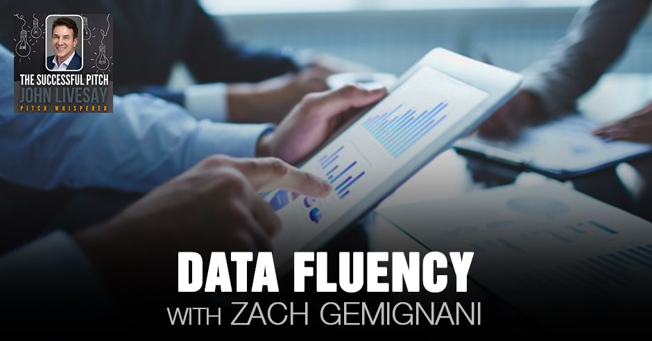
Even as we get bombarded with so much data today, many still don’t know how to use it for their business. It is time to change that and start to become data fluent before it is too late. In this episode, John Livesay interviews the founder and CEO of Juice Analytics, Zach Gemignani, about the need for data fluency, learning the language of data and turning it into an empathy tool that will set you apart from your competitors. More importantly, Zach highlights the role of taking action. After all, data without implementation is wasted money. He shares the ways we can present and use it effectively in our business in providing analytics and solutions that can positively impact people most.
—
Listen to the podcast here
Data Fluency With Zach Gemignani
Our guest is Zach Gemignani, the Founder Juice Analytics. We talked about the need to be data fluent. It is a language that if you can take data and turn it into an empathy tool, it will set you apart from your competitors. He said, “The last mile that people have to go to make data something that people take action from is the secret sauce.” Enjoy the episode.
—
Our guest is Zach Gemignani, who is the Founder and CEO of Juice Analytics, which is the company behind Juicebox. Zach is passionate about helping organizations present their data in ways that allow them to show it and not just tell it. He’s focusing on using some visualization solutions with his platform Juicebox. He focuses on advertising, media, healthcare, and research. They work with companies like Cablevision, HealthStream, and the University of Notre Dame. Zach has many years of experience in design analytics and data visualization. He’s also the coauthor of Data Fluency. Zach, welcome to the show.
John, I am happy to be here.
Our own little story of origin is quite interesting because I love the story of origins. We connected because we’re both passionate about storytelling. I work with sales teams on how to turn boring case studies into case stories. What you do is you’re turning relatively boring data into stories. That’s what made us want to connect and help clients with a combined solution. Before we get into that, let’s talk about your own story of origin. You can take us back to childhood or school wherever you want. Were you always somebody who loves numbers?
I was someone who was into math early. One of the interesting bits about my origin story comes from my parents. It helps inform a little bit about what we do at Juice and what I’m passionate about. I grew up in a family where my father retired from his job early so he could become an artist. There were a whole bunch of lessons in there for me, both around learning about art and visual representation, but also about pursuing your passion. That was an important lesson growing up for me. My mom was an educator. She’s a teacher. There were things about her passions that I’m sure I picked up in our interest in teaching people about how to communicate data better and doing that visually.
I often think that those two things tied together. As a company, Juice was founded many years ago. I started the company with my brother, Chris. We got to a point in our careers that we wanted to do something together and get out of the corporate world and strike out on our own. We knew we wanted to do something with data. He has a great computer science and data background. He’s the technologist and I am not, but we wanted to do something together. We decided we’re going to start this company. We didn’t quite know what we wanted to do, except that we wanted to do something with data. We found this passion in data visualization and around communicating data. This is a problem we saw long ago, and it’s a problem that organizations deal with still a lot these days. In fact, almost every organization we run into struggles with the fact that they’ve collected a lot of data, but they aren’t great at finding ways to present and share that data in ways that are impactful and useful to the people who should be looking at that data.
Give us an example of a company that you worked with or worked for where you see a lot of time and money is spent collecting data and the whole purpose of collecting that data was to allow management to make better decisions. Otherwise, it’s a stab in the dark of, “Should we do this or that? What do people want?” What happens when you present a bunch of data in a way that’s overwhelming and too hard to consume for top-level management decisions?
[bctt tweet=”Data without implementation and interpretation is really wasted money.” username=”John_Livesay”]
That is the standard mode. People present data in lots of charts and in complex reports. I will often go back to one of our first clients. This is where we found our passion. We were working with a client in the online schooling space. They wanted to understand better their customers and students who were unenrolling and the journey that customers were going through as they were working with this company. We had done a bunch of analysis and put together some results. I remember it was a day before our presentation to be able to share that data. At the time, we were working in my basement because we were just a startup.
Chris and I started to think about how we could share this data in a way that was going to be far more compelling that would capture the imagination of the executives. It’s hard to take a bunch of dry data, get people to understand it, and have an emotional connection with it. What we did through that night was we created an animated movie out of the data that presented how students came and left the schools, where they went, and things that happened to them. We got excited about this and we felt like this was a way to try to hook our audience and help them have more of a visceral connection with the data.
We presented that the next day a little tired having stayed up the night. We were younger then and it did have a great impact. That was the jumping-off point. That was the epiphany for me. If you can get creative with data and visually show it in ways that are going to be far more engaging, you can open up the minds of your audience so that they start to understand what’s going on with that data. That’s what’s going to get them closer to doing something about it. You need to make that human connection and that emotional connection with data.
I love what you said because it’s the same thing that I talk about, which is stories allow us to be compelling, capture our imagination, and have this emotional connection. Everybody buys products and services or changes their behavior emotionally first and then backs it up with logic. The challenge is data are traditionally left-brain analysis where decisions are made. Behavior changes are done on the right side of the brain, which is where imagination lives and all of that potential lives. You bridge that gap. I would say that what you’re doing here is the data without implementation and interpretation is wasted money.
This is something that a lot of organizations don’t necessarily look at or understand, but it’s a fact of a lot of situations where companies have spent a lot of money on gathering data. There’s been a lot of investment in big data and data warehouses, and getting all that information together. There’s no value created out of that data. In fact, that data should be considered a cost up until the point that it is delivered to people who make decisions and those people start to make better decisions based on the data. It’s a concept that we’ve talked about for a long time that we call the last mile of data. It’s that last step of how do you present data in ways that are going to be easy enough for your audience to understand what it means and how it ties to things that they can do in their job?
What actions can they take based on what they’re seeing so that they can make a better outcome for their organization? It’s that last step that a lot of companies struggle with. I’ve theorized that people ran out of energy, in a way. They get the ball to the 2-yard line and they’ve exhausted the resources. If the data part of what you’re doing has been driven by a technology organization that feels like the job is done by simply making the data available, that is also not a success. We’re trying to get people across that finish line or into the end zone so that people are using that data. That’s the key.
Data Fluency: Empowering Your Organization with Effective Data Communication
It’s a great tweet, “Go the last mile with your data so people can make better decisions.” There’s a book called 212: The Extra Degree and it’s all about water doesn’t start boiling until it hits 212 degrees. When it comes boiling, it creates steam and the steam could move the train engine, let’s say. Many of us get all the way to 211 degrees and then we dial down the heat. This analogy holds up going the last mile. If you’ve got all this time, money, effort, and you’re exhausted, and you’re like, “It’s good enough. We got the Excel chart, let them figure out how to make this mean something.” It’s that extra degree of effort that you’re bringing.
To go back to our combined origin story and talking to you about storytelling, it’s a skillset that a lot of people haven’t yet learned. They need to learn of combining both the understanding of the data, but then how do you connect that to your audience and to people. It’s a mix of skills there that combines understanding the psychology of your audience, what they do in their job, and what does it take for them to be more successful, which is a sales attitude. If you’re in sales, it’s instinctual to understand your audience and what makes them successful. If you’re in a reporting role or a data analyst or something that is not instinctual, it ties to data visualization, which we’re experts at of thinking about what is the best way to present data, and how do you make it intuitive? It ties to the structure of storytelling. A lot of what we think about at Juice is how do we take the concepts of storytelling and bring that into how you present data?
What you described that you are turning this data from the online school into an animated movie, you were taking data and turning it into an empathy tool, which is the key to storytelling and sales? I tell my clients all the time, “Put your empathy hat on. The better you can describe a problem, the better people think you have their solution.” There’s all of that storytelling journey of painting a picture of who, what, where, and when. This is the moment in time that you took and collected the data, and then here’s the problem we discovered.
If you are telling case stories, for example, you tell the solution and then the secret sauce that’s similar to that last mile. What most people don’t use when they’re telling stories whether it’s a case story, their own story of origin, or even an elevator pitch is what is life like after these changes have been made. When you’re telling that story of the online school and seeing the animated film, they then could have empathy for the students and knew what they needed to change to keep students from dropping out or to get the students to give them more referrals, something along those lines.
You touched on a couple of things that are important themes in data storytelling. One is setting those stakes is something that people don’t do. A great story has high stakes. This is why every action movie is about how do we save the world? They’re always cranking up the stakes, but whatever story you’re telling has to matter to people. It has to connect to why is this important to you. This is something that often you’re never going to see in a traditional dashboard or some Excel report. No one’s setting up why this matters, why it’s important, and why if you make that change, something good is going to happen. We do try to incorporate that into the data stories that we created. It’s setting that stage and those stakes, and showing what actions you take. If you take those actions, what the value is.
The other piece that I love to connect to storytelling is the specifics. Data has this nature to it that is an abstraction. Data is taking a bunch of things that are happening in real life and turning those into numbers. Often, we are rolling up, averaging, or summing up those numbers in a way. You get separated from the real thing that’s happening on the ground that you’re measuring. An event that’s related to that is the COVID pandemic. We’re always talking about the numbers and how big those numbers are, but those are real deaths. We talk about 180,000 deaths in the United States. Those are real people.
[bctt tweet=”Whatever story you’re telling has to matter to people; it has to connect with them.” username=”John_Livesay”]
The ability to combine both the big picture, the analytics and the numbers, but also be able to bring in the specifics that are way more likely to create those emotional connections that you’ve talked about. It’s hard to connect to a big number, but if you bring it to a person and you have a human face on something, that’s something where you start to build that bond with your audience and they start to feel what you’re expressing through the data. One of my favorite quotes is, “Specificity is the soul of narrative.” It’s by John Hodgman, another well-known podcaster. He likes to say, “When people tell stories, you want to bring in the specifics because that’s where you do connect with people.”
I work with people all the time when they’re telling a case story of that exposition. I said, “Was this last year, six months ago? Where was it? What city are we in?” Give your client a name. Don’t say, “My client or my customer.” Nobody wants to be thought of as a customer. You don’t want to be thought of as a vendor. If you want to warm things up, give this person a name, say where they work, describe their pain point in such a way that people can see themselves in the story. That’s where the magic happens is when that empathy comes in. Storytelling allows people to change behavior without being pushy because when we tell a good story visually and with some structure to your case stories, people see themselves in it.
Imagine you’re telling another online school or even a major university that had to go online in ways they never expected before and they’re struggling to try and figure out, “How do we justify our higher fees that we have for live classes?” That is much like I’ve had to do as a speaker. What value am I bringing to a virtual keynote that might make it even more impactful than in person? You have to think like that and have that story ready to go so that if you’re struggling to justify your prices as a Harvard or Pepperdine or whoever it is.
Imagine the journey of what this person’s life is like and get specific. If you look at the data, I know a lot of major universities have people from foreign countries coming here to become educated. If that’s not possible and they have to do it virtually, the more specific we get into one person’s journey, then it applies. It’s the same thing when I work with nonprofits. I go, “Don’t tell us about how many meals you deliver. Talk about one person’s story of why they needed a meal delivered in the first place and what would happen to them if they didn’t have the food coming.”
You can zoom out and be like, “That’s happening a thousand or a million times.” You can then multiply that out and it’s powerful if you can connect that stuff to a dollar figure, so people relate to that. Those are great places to start in the stories. One of the things that I’m curious about and that I’ve been surprised by is how much bringing data storytelling can be valuable in the sales process. While we work with lots of clients who are building data products to deliver value to their customers, the customers they already have, and had this data conversation with our customers.
There are many scenarios where it feels like bringing data into the sales process in a way that ties the storytelling can be powerful. It’s the combination of telling those compelling stories of the value of what your product delivers and being able to back that up with often interactive data so that you can have a customized story that creates that foundation of like, “This is a compelling message in our sales.” There’s also this foundation, a solidity to data that some people react to. I’m curious in your experience, how much bringing data have been valuable in the sales process?

212: The Extra Degree
The key mistake most people make when they’re selling is, they start with data. For example, one client was saying, “Our equipment makes surgeries go 30% faster. That’s what we’re opening with. Do you think that’s a good hook?” That’s data. I’m like, “There’s no story there.” I zoomed out and I said, “What is it? Paint the picture. What are they doing? Without your equipment, how long is the typical surgery?” They said, “It is 2.5 hours.” I said, “If we do the math, what’s 30% faster?” “Only 1.5 hours.” You could try and make a case for the doctors. They could do one more surgery and make so much more money, but a much more compelling story was, “Imagine how happy Dr. Higgins was at Long Beach Memorial using our equipment. He could go out to the patient’s family in the waiting room, where every minute is like an hour, and tell them an hour earlier than expected that their loved one did not have cancer.”
It’s the same data point, but it’s wide and that data point matter. That’s what you’re emphasizing.
The visuals that could go with that could be anything. Imagine this person’s telling that story and they have an image of a clock and every minute feels like an hour. If you’ve ever been in a waiting room waiting for a loved one to come out of surgery, you know that’s the truth. That shows empathy. Who you have in your stories? That’s the real secret that we bring to the party. It is the characters that a lot of people don’t even think about. They don’t think about the patient and the doctor. They hadn’t even considered telling a story of what the patient’s family was going through. The doctor then says, “That’s why I became a doctor, for those moments where I could give good news and earlier than expected makes me a hero.” When the salesperson tells that story to another potential doctor, that doctor sees themselves in that story.
It’s bringing humanity and empathy into the equation. I’m sure people in sales struggle with that case. I might argue it’s even more of a challenge in the data world where there’s this separation. People think of things like data and they often create this separation from the people who are on the other side of that data. It is often like, “Go ahead.”
You mentioned something about interactive data. Tell me more about what does that look like to people?
This is fundamental to what we do. We have this technology platform called Juicebox, which is a self-service tool for being able to build interactive data stories, which is a more compelling way of presenting data than traditional dashboards and reports. When we think about data stories, we’re not thinking about a static collection of slides that you might be familiar with a number of charts on it. We’re thinking about giving your audience the ability to navigate through the data in a guided and narrative-driven way. The solutions that we create with Juicebox allow the users of that data to walk through the data where we’re explaining what’s going on with the data, why it’s important, all the things we’ve touched on. We are giving them specific examples. We’re also giving them the power in that interactive data story to be able to choose things that matter to them.
[bctt tweet=”When people tell stories, you want to bring in the specifics because that’s where you really do connect with them.” username=”John_Livesay”]
As the user, everyone who comes to a report or data is going to have their own needs or things that they care about. They’re coming from the perspective of, “I care about this product or this region or these types of customers.” They have their own needs. You’re trying to meet them in a place where you’re telling this guided story through the data, but the user is also empowered in that process to be able to select where they care about. The data is going to change as they select things or as they explore the data. It makes the story relevant to that audience member, which is important. You want people to see themselves in the data or see what’s most relevant to them so that they can understand what they should do about it.
CFO cares about something different than the CMO would care about.
We can argue their stories, there will often be a number of different metrics you’re looking at that are the key metrics for your organization, but a CFO is going to want to drill in on cost-related things. A CMO is going to be worried about leads that are being generated or revenue side things.
“What if we raise our price by X percent and keep selling the same? What would that do?”
You’re mixing. In our data world, we want to be able to have this balance of letting someone explore and customize based on their needs, but in a way that it doesn’t require them to be a data analyst or to be super familiar with the data. It’s a challenging balance to find, but it’s what people want when they’re working with data.
We all are familiar with Excel sheets, which allow you to change one variable and see what the differences are. If you don’t have to be the first person that manually goes in and changes it and then still looks at a chart, but can click to change one thing and then see the visuals of sales going up or down. That’s to me is more engaging than considering looking at an Excel spreadsheet, which is you’re solving a problem.

Data Fluency: Almost every organization you run into struggles with the fact that they’ve collected a lot of data, but they aren’t great at presenting and sharing it in an impactful and useful way to the people who should be looking at that data.
If you send someone an Excel spreadsheet, the chances of them opening it up and wanting to get in there and deal with it are a little low. Making your stories attractive, intuitive, and easy to get started with is important. We’re focused on the design and the user experience so that we can give people data in ways that feel a lot more like the mobile apps that we work with or the modern website experiences we have, rather than feeling like, “I’m opening up a spreadsheet. I got to go figure this out.” Attention spans are short.
You’re like a Sherpa. If you look at the data of climbing Mount Everest, you’re trying to tackle it, get up there by yourself, and you get frustrated and maybe lost even. If you’re the Sherpa who’s been up this mountain many times and knows the shortcuts, you guide them through this data. It almost reminds me of some video games that let you create your own ending. If you click on this, then that completely changes how the story ends.
To go back, I will often think about those old Choose Your Own Adventure books. A data story can be a little different than a traditional narrative that has a clear sequence and gets you to a single ending. In an interactive data story, there’s an opportunity for the reader to decide what they care about and to make some choices in the paths. It should be as compelling as a regular story, but you’re giving that user some amount of autonomy and control of what they’re seeing.
What’s where the title of your book comes from. Data is fluent. There’s a fluidity to it, as well as it being a language. Are you fluent in data as you are fluent in Spanish or something? It’s a clever play on words of thinking of it not being the solid piece of ice, going back to the 212-degree thing, that can become steam and move things if you have fluidity and understand that language in a way that encompasses visuals.
We wrote that book because we saw a lot of organizations gathered a lot of data. They’re trying to figure out how they get value out of that data. They want people in their organization to be data-driven. We hear this a lot, but organizations struggle with how to make that happen. There are a lot of skills and changes in mindset that need to occur to get to this point where you’re using that data. You’re incorporating it into how you do your work, how you make decisions, and how you talk to each other. It’s language-based. You’re trying to teach people both the language of data, but also how to express yourself using data. Talking about it with you, it’s not just about data.
People need to understand that we can talk about data-driven, but that shouldn’t mean that the data tells me something and therefore I do something. Humans are an important part of this. It’s not dictatorial. We don’t want that. We all know where that ends up. It’s the combination of being able to incorporate data into how you think and how you have conversations with clients and so forth, but bringing that human aspect into it. You are recognizing that people are driven by emotion and you need to connect to what’s important to people. All that stuff needs to be in the mix. It’s the combination and it’s powerful.
[bctt tweet=”The magic happens when empathy comes in, and storytelling allows people to get others to change behavior without being pushy.” username=”John_Livesay”]
How did you come up with the name of your company and the product?
Juice Analytics is the name of that company. When Chris and I were thinking about naming the company, we were thinking about how do you extract value from data. We had this concept of extraction and squeezing things out of it, creating the essence of it. That’s how we got to the word juice and we were attacked on analytics that people think we’re making juice. We get a lot of emails for people wanting to sell us juicing equipment.
It sharpens a lot of strange SEO outcomes, I’m sure.
The product itself that we are selling as a self-service platform is called Juicebox. That was a natural extension of taking all of our best practices and thinking about how do you tell data stories and putting that in a box so other people could use it.
Who would you say is your ideal client? Who needs this platform that when they find it, they’re happy?
It’s a broad range. There are a lot of people in organizations. I’ll give you a few examples of people who are working with data. They have an important audience that they’re trying to influence with that data and yet, they struggle with bridging that last mile. Marketing professionals and marketing analysts who are running campaigns and measuring their performance of those campaigns, the most important thing that they need to do at the end is to define what has been the impact of that campaign and how do we improve it next time. Packaging that up, extracting the message, and communicating that to the people who have the budget is critical. Whether that’s a marketing agency or that’s an internal person, that step of showing the value that you delivered and how you can do better or tune it is a common use case for us.
Nonprofits who want to tell their story of what they’re doing is delivering an impact. Sometimes, that’s done in a public way. They want to put it on their website and show that they’ve served an audience and it’s delivering a lot of value. That’s another example. Anyone who’s done consultants and people who do research, done a survey, or gathered a bunch of data, they now need to show the results in a way that is going to demonstrate the value of what they’ve done, and the messages and the conclusions that they’ve reached. We get deep into this because we talked a lot to organizations. It’s hard not to find organizations and people who at some point, don’t need to take some data that they have and have a much better way of being able to deliver that so that they can reach the audiences who should be looking at that data.
The company name is Juice Analytics and the website is JuiceAnalytics.com. The book that Zach co-authored is called Data Fluency. Do you have any last thoughts or quotes that you want to share with us?
I don’t have a quote, but I do appreciate your emphasis on creating those emotional stories. I hope that we continue to work together to learn more about that. That’s a piece that we would love to incorporate even more into how data analysts, and people working with data can make the connection to people and change their minds. It’s been a real pleasure.
Thanks for coming to the show, Zach, and sharing your brilliance.
Important Links
- Juice Analytics
- Data Fluency
- 212: The Extra Degree
- Choose Your Own Adventure
- Juicebox
- Better Selling Through Storytelling Method Online Course
Wanna Host Your Own Podcast?
Click here to see how my friends at Podetize can help
Purchase John’s new book
John Livesay, The Pitch Whisperer
Share The Show
Did you enjoy the show? I’d love it if you subscribed today and left us a 5-star review!
- Click this link
- Click on the ‘Subscribe’ button below the artwork
- Go to the ‘Ratings and Reviews’ section
- Click on ‘Write a Review’
Love the show? Subscribe, rate, review, and share!
Join The Successful Pitch community today:
- JohnLivesay.com
- John Livesay Facebook
- John Livesay Twitter
- John Livesay LinkedIn
- John Livesay YouTube
Tags: Business Communication, Data Fluency, Date-Driven, Empathy, Sales, Using Data